Wednesday, 13 April 2016
11 Second Club challenge

Well pretty straightforward competition. I loved the idea of character animation because yet again it gives me an opportunity to play around with characters. Since the website provides free rigs it was tempting to try and work with 3d again however I still went with flash because I felt I would have been more of a challenge. I did nit had a lot of time for this brief because I had a eek left for submissions, this due to me failing at time management but is till went on to attempt animate an appealing character.
I started of with some idea generating sketches as to who I thought the character should be.

But then I realised I was going to on the nose with it. Why can't it be an animal? So i juggled with that idea-

So once again I went with the animal idea. Because I thought it would be a bit contrasting to the audio and thus give it more character. So I started animating it. What I did was putting in the audio file into flash and animating a stick figure into what i thought would help to play out the character more and play around with body language. SO i built it the same way as usual.


Powering through three 12 hour days I managed to animate it and soon after submit it. This project was a quick one yet the most difficult one. I did not do any pre production or preparation for it but it was demanding to animate everything frae by frame. I am happy with the way it turned out and it seemed to make my peers lough which was the whole point. here is the final animation and the submission screenshot-


Orchard Pig: finishing up and submitting
So as I passed the character onto Wing she textured it pretty quickly and really nicely . Then she went on rendering out .png pictures of the mascot and photoshopping them into context-


We went through the feedback and decided not make any major changes so we submitted the project. The competition asked for us to describe the project and how it affected our view of the brand-


And finally it was submitted!!


We went on to

We presented all of our work we had in the final critiques session, which was a week before submissions. This meant we had time take aboard the feed back and give the project some tweaks and changes. But unfortunately we did not get any major feedback on the project itself. More about the presentation and that we should have shown the development as well.


Do it In Ten: Animating TRANSITION
So without any big planning or pre production work I went straight to animating. I decided to divide the 10 second timeline into four parts giving equal time for all of them. So for the baby part of the animation the items i chose were a milk bottle, a pacifier and a par of baby shoes because for me the shoes represent comfort, milk bottle represents the dependency to the care taker and the pacifier because only babies use it, so they basically define this period of life. As for the backgrounds yet again I kept it simple however I made them change colour so as to amplify the tradition and if you look closely enough the background goes through the colour spectrum coming back to where it began thus closing the circle. For the childhood part I have picked a football representing games and fun, a teddy bear representing innocence, a book representing learning and candy for curiosity. For the adult part there's a briefcase bills and coffe representing priorities, responsibilities and energy. In the last section there are glasses- wise dome, cane- physical health and medicine because honestly just needed something small for the composition.


 With this project I worked in the same method I worked with the Animated Self animation I did last year. I just set up the main sections and in between animated lines flying around and finding their way into the shapes. This animation did not take me that long to make but I actually enjoyed it very much. As soon as finished it was submitted and on the Do It In Ten page.
 So here is the final animation with the soundtrack-


Orchard Pig: Mascot Design part two
Once we were both happy with the last poster I went on making the 3d model of The Pig. Going back to Maya was a bit scary but once I realized I still had a fresh memory of whats what left from the Character and Narrative module I was really confident with making the model. Surprisingly enough I did not need a refresher course on how to use modeling tools so I just got on with it. I started of the same way we did with the demo character back in Character and Narrative- with the pelvis and working my way up.

As I made it up to the head I had a problem with the ear as it was a very complex shape. It was not as much of a problem as just a really tricky bit, that needed a lo of consideration and careful modelling so as to keep the model neat and tidy with no unnecessary vertices or such.

As I completed the head I went on to the legs and feet. I made a small curl in the legs geometry so as to compliment the material and that then finished up the feet.


As soon as I was done I was really happy with how it turned out so I made a quick turntable for the model-
Now it was ready to be textured so I handed it in to Wing.
Since I have done the bigger part of the mascot design Wing volunteered to make some rendered out pictures with the mascot participating in festival stands and football games. As the pictures were finished we were ready for the final crit session.
Do It In Ten: Idea generation
TRANSITION
the process or a period of changing from one state or condition to another.
"students in transition from one programme to another"
synonyms: change, move, passage, transformation, conversion, adaptation, adjustment, alteration, changeover, metamorphosis;
I understand transition as evolving. Life for instance how a caterpillar becomes a butterfly or a tadpole changing into a frog. Transition is a beautiful thing and it is everywhere in nature. Plants and animals transition as well as the weather. The seasons transition into each other thus constantly changing- the old make way for the new, thus continuing the circle in life. As I was thinking these things I thought about the transitions we go through as we live our lives. What are the main periods in life and what kind of changes distinguish the?
So I thought the main stages of life is newly born, child hood, adulthood, and elder age. The reason I though new born is a stage of life is because it is a very delicate age which we may not recall but which definitely shapes us in more than one way. That is when our subconscious starts gathering information and grasping together parts of our surroundings, putting together what is what. It is a very delicate age when we are entirely dependent on the care taker and even the slightest discomfort is the biggest pain you have ever felt. Then comes the child hood- curiosity, exploration and molding yourself into who you will become. As children are still being taken care of they have the freedom of exploring life without the responsibilities or routine of adult hood. And them adult hood is the period of responsibilities, regenerating, taking care of others. The elder age is wisdom and truth. The experience life has provided you with it is your duty to carry on your knowledge onto the young and thus making way for them.
I thought this was an interesting idea to explore the transition of life, but without using characters because there is only so much you could fit into ten seconds and I wanted to animate something nicely instead of making a lot of pre production and not executing it properly like the last time with the fox idea. So I decided to represent the different stages of life through the stuff we use.
As I made a few sketches I went on to animate it. To be honest I did not spend a lot of time on research and sketching with this brief because I wanted to concentrate on the animation itself.
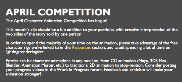
Do It In ten competition
‘Do it In Ten’ is Show Me The Animation’s monthly animation challenge. The challenge is simple, we give you a theme and all you have to do is respond to that theme within a ten second animation.
We showcase every entry upon the Show Me The Animation website, and at our Animation nights. At the end of each month we then select a monthly winner who is put forward into a Best of challenge at the end of the year and be in with the chance of winning an animation goodie bag. The 2015 goodie bag has some fantastic prizes including 1 year licence Toon Boom Harmony Advance, Limited Edition Hyno Cat T-Shirt, Shaun The Sheep The Movie (DVD) and we can confirm the 2016 goodie bag will also contain a 1 year licence for Toon Boom Harmony Advance.
The second theme of the year for March is TRANSITION, and we’re really excited to see how you interpret the theme this month. As usual after all the entries have been reviewed a monthly winner will be announced in early April, who will then be put forward into the Best of 2016 contest and be in with a chance of winning an animation goodie bag. Just like 2015, we can confirm we will again be giving away a Years licence to Toon Boom Harmony Advanced to the overall 2016 winner, as well as a host of other animation goodies including books & DVD’s. To be in with a chance of being the Best of 2016 winner all you need to do is respond to theme TRANSITION with a ten second animation.
All entries will be showcased on the Show Me The Animation website and a winning entry will be chosen in early April.
RULES:
1) Your entry must be no shorter or longer than 10 seconds.
2) If you wish to include title and end slates these must be within the 10 second limit.
3) Entries must be received by 31st March 2016 to be considered for this months challenge.
4) By entering you agree that your film may be screened by Show Me The Animation at one of their animation evenings.
6) The same person may win more than one monthly challenge per year, therefore having more entries in the running for the Best of 2016
5) By entering you agree that your film may be used by Show Me The Animation upon its digital platforms (E.G. ShowMeTheAnimation.com, twitter, facebook).
6) Show Me The Animation agrees to credit creators of each entry in all instances of its use.
7) Copyright/I.P remains with the films creators.
Well this seems fun. I guess were doing it in ten!!
Do It In Ten: Chilly
In the spirit of December do it in ten released the theme Chilly.
So I decided this could be interesting and went on to generate ideas for it.
adjective, chillier, chilliest.
1.
mildly cold or producing a sensation of cold; causing shivering; chill :
a chilly breeze.
2.
feeling cold; sensitive to cold:
Her hands were chilly.
3.
without warmth of feeling; cool:
a chilly reply.
4.
producing or likely to produce a feeling of fear; frightening:
He told a chilly story of ghosts and murder.
adverb
5.
Also, chillily. in a chill manner:
The wind blew chilly.
My first few idea were to do something with snow, because then it doesn't have to be in colour and its can take a very playful direction. The first few ideas I gad were about icicles and how your tongue can get stuck to them if you lick it. But then I realised this image came from Spirit: The stallion of Cimarron.

But I was positive I wanted to do something with animals because I would get a chance to work on my character design skills. Another thing that popped into my head was the scene from Brother Bear where they were doing the salmon hunt. It was such playful and nicely animated scene, especially where the main character struggles to catch a fish and falls into the water.
 And another thing that came into my mind was obviously the iconic Bambi and Stomper on ice scene,


Afterwards I went on doing my own sketches and generating ideas for the character.
 I liked the pop out chest feature and the bending lines from the neck going onto the ear forming an S shaped character. Another thing I wanted to do is try and imagine the character in a asituation so I went with the Stallion of Cimarron idea of licking an Icicle-
 I started enjoying sketching this character so i went on making a few more-
 I was really happy with hoe my character was shaping up so i went on and made a run test for it on Flash. First I looked into other examples of running cycles for reffrence


Then I drew on to of it.

Something in the cycle did not seem quite right so as I was drawing on it I tried to change it a bit which apparently was not such a good idea, because when it was finished it did not look right at all. I think it is because the front legs should leave the ground later than the back legs, whereas I made them leave the ground at the same time which did not look right. Basically I realised that the all the less were supposed to touch the ground at different times, as if a a human walk cycle. I realised this only when I showed it to other people and they said it does not look like how it should.
So I decided this could be interesting and went on to generate ideas for it.
adjective, chillier, chilliest.
1.
mildly cold or producing a sensation of cold; causing shivering; chill :
a chilly breeze.
2.
feeling cold; sensitive to cold:
Her hands were chilly.
3.
without warmth of feeling; cool:
a chilly reply.
4.
producing or likely to produce a feeling of fear; frightening:
He told a chilly story of ghosts and murder.
adverb
5.
Also, chillily. in a chill manner:
The wind blew chilly.
My first few idea were to do something with snow, because then it doesn't have to be in colour and its can take a very playful direction. The first few ideas I gad were about icicles and how your tongue can get stuck to them if you lick it. But then I realised this image came from Spirit: The stallion of Cimarron.

But I was positive I wanted to do something with animals because I would get a chance to work on my character design skills. Another thing that popped into my head was the scene from Brother Bear where they were doing the salmon hunt. It was such playful and nicely animated scene, especially where the main character struggles to catch a fish and falls into the water.


All of these Disney examples of animals playing in the cold set the tone for me and what I wanted to do. All I really want t do with brief is nicely animate a character playing in snow. no real narrative or story or lesson there, just nice work on my character design and animation skills. So that is what I have started of with. The first thing I did was start sketching character ideas. I just went on a whim and decided to do a fox character because it would be the first animal I'd imagine in the forrest during winter. Also I wanted a slimmer figured animal so it would its movements would be light. Like snow!


Another thing I looked up how other artist have portrayed foxes, and dodge (because some of them have a similar physical appeaance) all it helped me distinguish which features I want to exaggerate and how I want it to look.


Then I made a stick figured test for reference so I could draw onto it later on.

Then I drew on to of it.

Something in the cycle did not seem quite right so as I was drawing on it I tried to change it a bit which apparently was not such a good idea, because when it was finished it did not look right at all. I think it is because the front legs should leave the ground later than the back legs, whereas I made them leave the ground at the same time which did not look right. Basically I realised that the all the less were supposed to touch the ground at different times, as if a a human walk cycle. I realised this only when I showed it to other people and they said it does not look like how it should.
I left this project for a bit because we went on holidays. As holidays came I was asked to do a lot of hours at work and I put this project away for whenever I would have more free time. Unfortunately that did not happen until January so the competition for Chilly was over before I could finish it which is a shame because I actually enjoyed it. I might just come back to it because I fell in love with the character and I feel like I should do justice by it.
Sunday, 10 April 2016
Orchard Pig: Mascot Design part one
We were nearing the end of our poster part of the project and planned on animating the posters, so they could be modestly animated gifs and they could be used as internet adverts. As I showed our work so far to my brother he gave me a few pointers on the composition and such. Another thing he suggested was to have a reacquiring character, like some brands have characters to help advertise the brand like cereals have their mascots for example Captain Crunch or Tony the tiger of Frosted Flakes. This suggestion stuck with me and I started thinking if we were to make a reacquiring character what it would be like for a cider brand. And then I thought about cider, where and when would I drink it and the first idea that came into my head was a football game. Then I thought about cheerleaders and mascots in sports games and obviously I made the connection of making a mascot for Orchard Pig because it would play out perfectly for the brand as Orchard Pig takes part in a lot of festivals and such. When I ran this idea through Wing she looked up what Orchard Pig sponsors (events and such) and found that they sponsor a football team which was perfect. We agreed that we would scarp the idea of making gifs and do a mascot design instead as it would serve a more meaningful purpose. I also suggested to make another poster featuring the mascot. We both were happy with the the new direction we've taken so we went on designing the character.


As Wing deigned the background for the mascot poster I went on doing the design for the mascot. Recently in a restaurant I work in I was asked to wear a mascot costume and take part in a PR event. While doing that nit only I realised what kind of an effective and cheap PR it was but I got actually wear a macot costume which gave me a lot of ideas on how it should be constructed and made. Ad for the PR side of the mascot, it was amazing that everyone wanted to pictures with the mascot and post it on social media and a more intimate way of networking was taking place. All of these things in mind a made few sketches.


Since Wing liked the first two sketches I mad the last two as reference Imagery for the 3d modeling. Also for the last two I used Illustrator, because apart from wanting to try it I thought it would be more accurate to make it in vectors as I wanted to make it as accurate as possible so the 3d modeling process would not be more difficult than it already is. After this, Wing handed in her finished background design and I incorporated the mascot pig. This was the final result.

Wednesday, 6 April 2016
Orchard Pig: Making Posters
After the brainstorming session we had a discussion of what those advertising posters should be about. We looked up the cider making process and immediatly agreed we'd like to make it in old sepia photos style, where the colours are a bit worn out and it looks like an old picture so it would amplify the old ways of making cider and the deeply rooted cider brand. As we went through the process of making cider we took notes of which stages we'd like to capture:
Collecting apples, pulping apples, the cider being bottled, the cider resting in barrels, and the founders picture. About the last one, we figured every brand that that stands for tradition and autheticity benefits from a founders picture/or story. Like the very successful Twix campaign. All over the world, when given a choice, people will choose what they love and then defend that choice to the end.
This creative work uses silly hyperbole and peoples' innate desire for debate to both involve the consumer and amplify the unique benefit of the two bars. It creates a playful world in which people are asked to choose which Twix they prefer, – the genius, however, is that it is impossible to choose between the two bars because, first, they are identical, equally delicious bars and secondly, they are always packaged together.
It is both a composition story, as it demands that consumers think about the make-up of each bar, and a story about the duality of the Twix product.
The next challenge? Delivering this story in a way that gave Twix a personality.

 Adverts like these stick in your head because they are witty and in a way ridiculous, how ever it gives you this sense of an old story the brings out the excited child. All in all advertising is all about triggering that sense of love in your brain. The adverts are supposed to make you fall in love with the product, that's why all the perfume advert models have this sexual gaze straight into the camera. Other products do it in a different way, but ultimately the goal is the same.
So we figured that a founders picture with pigs would play into this witty story telling idea very nicely. The next stage was sketching.
As we discussed that we were going after this old photo look like for example this:

 So you can see the texture of the photos and there is barely any colour. We wanted to have colour but bring in the texture, so I remembered this technique of soaking paper into coffee or tea and using that as a texture. I suggested it to Wing and she volunteered to try it. I grabbed a random example of texture paper from Google images and tried working with them on photoshop. So I came with a few sketches-


Wing liked how it looked so she took it upon herself to see what she could come up with for the backgrounds. The next time we met up, Wing had a few background sketches ready for me and I asked her to make a few tweaks and adjustments so the composition would fit the characters. We started off with the founder picture. As soon as the backgrounds were done and ready for me I took the up to do the characters. First I made quick sketch of how to compose the characters-

 I then went on looking up how the people of 1850s since that's when Orchard Pig claims on it's site their history roots down to. So as I was looking up the way people used to dress up in the mid 19th century I wanted all sorts of looks to come through- rich, poor, farmers etc.


Collecting apples, pulping apples, the cider being bottled, the cider resting in barrels, and the founders picture. About the last one, we figured every brand that that stands for tradition and autheticity benefits from a founders picture/or story. Like the very successful Twix campaign. All over the world, when given a choice, people will choose what they love and then defend that choice to the end.
This creative work uses silly hyperbole and peoples' innate desire for debate to both involve the consumer and amplify the unique benefit of the two bars. It creates a playful world in which people are asked to choose which Twix they prefer, – the genius, however, is that it is impossible to choose between the two bars because, first, they are identical, equally delicious bars and secondly, they are always packaged together.
It is both a composition story, as it demands that consumers think about the make-up of each bar, and a story about the duality of the Twix product.
The next challenge? Delivering this story in a way that gave Twix a personality.


So we figured that a founders picture with pigs would play into this witty story telling idea very nicely. The next stage was sketching.
As we discussed that we were going after this old photo look like for example this:


Wing liked how it looked so she took it upon herself to see what she could come up with for the backgrounds. The next time we met up, Wing had a few background sketches ready for me and I asked her to make a few tweaks and adjustments so the composition would fit the characters. We started off with the founder picture. As soon as the backgrounds were done and ready for me I took the up to do the characters. First I made quick sketch of how to compose the characters-


And then I started to refine the characters and put some clothing on them. I tried to keep the colours in a similar shade of the backgrounds as well as the outline so it doesn't pop out too much.

When I was finished with the characters I sent it back to Wing and she added the final touches (logo, cider bottles) and the general overlay of the texture. So here is the final poster of the founders picture:

We both agreed we were very happy with how it turned out so we went on doing the rest in the same way: Wing would make the backgrounds, layer them if necesary and I would draw in the characters. This demanded some tidy housekeeping in the photoshop files so that the other person would easily understand what can be found where and if change was necessary it would be easily fixable.
Subscribe to:
Comments (Atom)