Monday, 23 March 2015
Discovery Ident animatic
Okay so i finally made an animatic for the Discovery ident so I could work out the timing. I did it on Flash and I tried out the technique that was introduced to us during Animation Process and Production module- Motion Tween. It is a new feature in Flash CC and to be honest it is not that good. It was frustrating to work out the trajectory of an object was not easy to adjust, in fact I could really figure out how to do it so use the Ease feature, which somewhat changed the trajectory. I have only roughly worked out the character design, however it need more tweaking, I did not include any background action or colours. So there is still some consideration left towards the pre- production.
Thursday, 19 March 2015
Drawing in Animation: Duet
This animation is simply astonishing and one of those things that you can re-watch endless times. It was created by Disney's animator Glenn Kean.
And while Keane and company got a few lessons in programming, the programmers got to participate in a life drawing class, so they could get a better idea where the artists were coming from.
And drawing is what Keane and his animation assistant Sarah Airriess did quite a lot of because the programmers needed the roughly three and a half minute film to be a mind-boggling 60 frames per second, quite jump from the 24 frames per second Keane was used to. “Max and I would drive home just struggling with this 60 frames per second,” Keane recalls.” That translates to 60 drawings per second and that’s a lot of drawings. “The big missing piece was that every frame was being held for two frames,” explains Max Keane, “So 24 to Glen actually meant 12 frames and when we found that then that gave us a common ground.”
“Twelve goes into 60 five times,” notes Glen. “And that was the Rosetta Stone.”
They worked out with “Duet” technical project lead Rachid El Guerrab what frame rates they could use. “He went down this list: 10, 15, 30, 12,” recalls Max. “He said 12 and it was like, ah-hah! We can do 12. It was like a lightbulb.”
Ultimately Google ended up using 10,555 frames, a lot of drawings for Keane. “You probably threw out 2,500 other ones in the process,” Max reminds Glen.
“I don’t think of it as drawing after drawing after drawing,” Glen Keane says. “I think of it as a melody.”
Keane relished another difference that the making of “Duet” opened to him. “There are no cuts. And I love that idea. A seamless unbroken conversation with the character that you’re having. And if I needed a close up, I would draw them closer. There was such freedom of movement.”
Keane is hoping to carry his new insights into his next venture. “I really love the freedom of this type of storytelling and I’d really like to keep exploring that,” he says.
Despite his long and storied career in animation, “Duet” is Keane’s first time as a director. He was at Disney and directing “Rapunzel”(later renamed “Tangled”) when he had a heart attack in 2008, and had to step away from the director’s chair. And now that’s he’s left Disney, he’s ready to explore more on his own. “I have some ideas I’ve been cooking for a long time,” he notes.
But another project like “Duet” isn’t what he has in mind. “I don’t want to say that I wouldn’t do another one. It was fascinating and wonderful,” he says. “But I’m not driven by the technical side of things. I’m driven by the artistic, the need to say something. And I have some ideas that I really want to say. And that’s where I want to focus.”
But he’ll always be thankful for his brush with technology. ” I never could have told this story without that technology. It just would not have gotten there. That’s the wonderful, surprising thing.”
Sound Visualisation: Move Your Feet
I picked this video because it is simple yet cheerful. It never fails to lift your mood and the tune it self is really catchy.
"Move Your Feet" is a song by Danish pop duo Junior Senior. The song, released in 2003 was Junior Senior's biggest hit, reaching #3 in the United Kingdom and #20 in Australia. The song appears on the album D-D-Don't Don't Stop the Beat along with a live recording. It features lead vocals by producer Thomas Troelsen. This song was accompanied by an animated music video by the art collective Shynola, using low-resolution pixel art produced using Deluxe Paint.[1]
The music video shows various scenes of a pixel-art Junior Senior and a squirrel. Throughout the video, many pixel-art figures are seen dancing. The video received heavy airplay on music channels in Europe at the time of the song's release.
Sound Visualisation: Gnarls Barkley
I decided to look into animated sound a bit further, this time I picked the video to Gnarls Barkleys "Crazy".
"Crazy" is the debut single by Gnarls Barkley, a musical collaboration between Danger Mouse and CeeLo Green, taken from their 2006 debut album St. Elsewhere. It peaked at number two on the Billboard Hot 100, and topped the charts in the United Kingdom, Denmark, Canada, the Republic of Ireland, New Zealand and other countries.
Going along with the psychiatric theme of the song, Gnarls Barkley's music video for "Crazy" is done in the style of the Rorschach inkblot test. Animated, mirrored inkblots morph into another, while taking on ambiguous shapes. Both Cee-Lo and Danger Mouse appear in the shapes, as do the band's gunshot/heart logo, "Satan", a cranium and various animals, including centipedes, birds, bats, spiders, and insects.
The inkblot illustrations were done by art director and motion graphic designer Bryan Louie, whose other works include commercial campaigns for the Scion tC, and produced by motion design studio Blind, Inc. The music video for "Crazy" was directed by Robert Hales, who had previously directed music videos for Jet, Nine Inch Nails and Richard Ashcroft, amongst others.
The video was nominated for three 2006 MTV Video Music Awards: Best Group Video, Best Direction, and Best Editing, and won the latter two. It was also nominated for a 2006 MTV Europe Music Award for Best Video, but lost to "We Are Your Friends" by Justice vs. Simian.
Visual Language: Color Theory part two
Basic Color Theory:
Color theory encompasses a multitude of definitions, concepts and design applications - enough to fill several encyclopedias. However, there are three basic categories of color theory that are logical and useful : The color wheel, color harmony, and the context of how colors are used.
Color theories create a logical structure for color. For example, if we have an assortment of fruits and vegetables, we can organize them by color and place them on a circle that shows the colors in relation to each other.
The Color Wheel:
A color circle, based on red, yellow and blue, is traditional in the field of art. Sir Isaac Newton developed the first circular diagram of colors in 1666. Since then, scientists and artists have studied and designed numerous variations of this concept. Differences of opinion about the validity of one format over another continue to provoke debate. In reality, any color circle or color wheel which presents a logically arranged sequence of pure hues has merit.

Primary Colors: Red, yellow and blue
In traditional color theory (used in paint and pigments), primary colors are the 3 pigment colors that can not be mixed or formed by any combination of other colors. All other colors are derived from these 3 hues.
Secondary Colors: Green, orange and purple
These are the colors formed by mixing the primary colors.
Tertiary Colors: Yellow-orange, red-orange, red-purple, blue-purple, blue-green & yellow-green
These are the colors formed by mixing a primary and a secondary color. That's why the hue is a two word name, such as blue-green, red-violet, and yellow-orange.

Color Context
How color behaves in relation to other colors and shapes is a complex area of color theory. Compare the contrast effects of different color backgrounds for the same red square.
Red appears more brilliant against a black background and somewhat duller against the white background. In contrast with orange, the red appears lifeless; in contrast with blue-green, it exhibits brilliance. Notice that the red square appears larger on black than on other background colors.
If your computer has sufficient color stability and gamma correction (link to Is Your Computer Color Blind?) you will see that the small purple rectangle on the left appears to have a red-purple tinge when compared to the small purple rectangle on the right. They are both the same color as seen in the illustration below. This demonstrates how three colors can be perceived as four colors.Observing the effects colors have on each other is the starting point for understanding the relativity of color. The relationship of values, saturations and the warmth or coolness of respective hues can cause noticeable differences in our perception of color.
So in conclusion- we do not know that the apple is red. It is just the way we read light reflecting on things.
Color theory encompasses a multitude of definitions, concepts and design applications - enough to fill several encyclopedias. However, there are three basic categories of color theory that are logical and useful : The color wheel, color harmony, and the context of how colors are used.
Color theories create a logical structure for color. For example, if we have an assortment of fruits and vegetables, we can organize them by color and place them on a circle that shows the colors in relation to each other.
The Color Wheel:
A color circle, based on red, yellow and blue, is traditional in the field of art. Sir Isaac Newton developed the first circular diagram of colors in 1666. Since then, scientists and artists have studied and designed numerous variations of this concept. Differences of opinion about the validity of one format over another continue to provoke debate. In reality, any color circle or color wheel which presents a logically arranged sequence of pure hues has merit.
Primary Colors: Red, yellow and blue
In traditional color theory (used in paint and pigments), primary colors are the 3 pigment colors that can not be mixed or formed by any combination of other colors. All other colors are derived from these 3 hues.
Secondary Colors: Green, orange and purple
These are the colors formed by mixing the primary colors.
Tertiary Colors: Yellow-orange, red-orange, red-purple, blue-purple, blue-green & yellow-green
These are the colors formed by mixing a primary and a secondary color. That's why the hue is a two word name, such as blue-green, red-violet, and yellow-orange.
Color Context
How color behaves in relation to other colors and shapes is a complex area of color theory. Compare the contrast effects of different color backgrounds for the same red square.
Red appears more brilliant against a black background and somewhat duller against the white background. In contrast with orange, the red appears lifeless; in contrast with blue-green, it exhibits brilliance. Notice that the red square appears larger on black than on other background colors.
If your computer has sufficient color stability and gamma correction (link to Is Your Computer Color Blind?) you will see that the small purple rectangle on the left appears to have a red-purple tinge when compared to the small purple rectangle on the right. They are both the same color as seen in the illustration below. This demonstrates how three colors can be perceived as four colors.Observing the effects colors have on each other is the starting point for understanding the relativity of color. The relationship of values, saturations and the warmth or coolness of respective hues can cause noticeable differences in our perception of color.
So in conclusion- we do not know that the apple is red. It is just the way we read light reflecting on things.
Visual Language: Colour Theory
So I few week ago I attended a lecture about colour theory. We learned some of the terminologies associated with colour theory and the main principle. We also learned how we perceive colour and and what dimensions the colours have.
We were asked, how do we know this apple is red?

Because its nor green? Because we have a mutual consensus that it is red?
Well first of all we have to understand how we see colour and how our brain and eyes process it.The eye is made up of two receptors; rods and cones. The rods are responsible for conveying black, white and grey tones, where as the cones deal with colour, but we can only perceive these colours when light is present.
The foundations of pre-20th-century color theory were built around "pure" or ideal colors, characterized by sensory experiences rather than attributes of the physical world. This has led to a number of inaccuracies in traditional color theory principles that are not always remedied in modern formulations.[citation needed]
The most important problem has been a confusion between the behavior of light mixtures, called additive color, and the behavior of paint, ink, dye, or pigment mixtures, called subtractive color. This problem arises because the absorption of light by material substances follows different rules from the perception of light by the eye.
A second problem has been the failure to describe the very important effects of strong luminance (lightness) contrasts in the appearance of colors reflected from a surface (such as paints or inks) as opposed to colors of light; "colors" such as browns or ochres cannot appear in mixtures of light. Thus, a strong lightness contrast between a mid-valued yellow paint and a surrounding bright white makes the yellow appear to be green or brown, while a strong brightness contrast between a rainbow and the surrounding sky makes the yellow in a rainbow appear to be a fainter yellow, or white.
A third problem has been the tendency to describe color effects holistically or categorically, for example as a contrast between "yellow" and "blue" conceived as generic colors, when most color effects are due to contrasts on three relative attributes that define all colors:
lightness (light vs. dark, or white vs. black),
saturation (intense vs. dull), and
hue (e.g., red, orange, yellow, green, blue or purple).
Thus, the visual impact of "yellow" vs. "blue" hues in visual design depends on the relative lightness and intensity of the hues.
These confusions are partly historical, and arose in scientific uncertainty about color perception that was not resolved until the late 19th century, when the artistic notions were already entrenched. However, they also arise from the attempt to describe the highly contextual and flexible behavior of color perception in terms of abstract color sensations that can be generated equivalently by any visual media.
Many historical "color theorists" have assumed that three "pure" primary colors can mix all possible colors, and that any failure of specific paints or inks to match this ideal performance is due to the impurity or imperfection of the colorants. In reality, only imaginary "primary colors" used in colorimetry can "mix" or quantify all visible (perceptually possible) colors; but to do this, these imaginary primaries are defined as lying outside the range of visible colors; i.e., they cannot be seen. Any three real "primary" colors of light, paint or ink can mix only a limited range of colors, called a gamut, which is always smaller (contains fewer colors) than the full range of colors humans can perceive.
We were asked, how do we know this apple is red?
Because its nor green? Because we have a mutual consensus that it is red?
Well first of all we have to understand how we see colour and how our brain and eyes process it.The eye is made up of two receptors; rods and cones. The rods are responsible for conveying black, white and grey tones, where as the cones deal with colour, but we can only perceive these colours when light is present.
The foundations of pre-20th-century color theory were built around "pure" or ideal colors, characterized by sensory experiences rather than attributes of the physical world. This has led to a number of inaccuracies in traditional color theory principles that are not always remedied in modern formulations.[citation needed]
The most important problem has been a confusion between the behavior of light mixtures, called additive color, and the behavior of paint, ink, dye, or pigment mixtures, called subtractive color. This problem arises because the absorption of light by material substances follows different rules from the perception of light by the eye.
A second problem has been the failure to describe the very important effects of strong luminance (lightness) contrasts in the appearance of colors reflected from a surface (such as paints or inks) as opposed to colors of light; "colors" such as browns or ochres cannot appear in mixtures of light. Thus, a strong lightness contrast between a mid-valued yellow paint and a surrounding bright white makes the yellow appear to be green or brown, while a strong brightness contrast between a rainbow and the surrounding sky makes the yellow in a rainbow appear to be a fainter yellow, or white.
A third problem has been the tendency to describe color effects holistically or categorically, for example as a contrast between "yellow" and "blue" conceived as generic colors, when most color effects are due to contrasts on three relative attributes that define all colors:
lightness (light vs. dark, or white vs. black),
saturation (intense vs. dull), and
hue (e.g., red, orange, yellow, green, blue or purple).
Thus, the visual impact of "yellow" vs. "blue" hues in visual design depends on the relative lightness and intensity of the hues.
These confusions are partly historical, and arose in scientific uncertainty about color perception that was not resolved until the late 19th century, when the artistic notions were already entrenched. However, they also arise from the attempt to describe the highly contextual and flexible behavior of color perception in terms of abstract color sensations that can be generated equivalently by any visual media.
Many historical "color theorists" have assumed that three "pure" primary colors can mix all possible colors, and that any failure of specific paints or inks to match this ideal performance is due to the impurity or imperfection of the colorants. In reality, only imaginary "primary colors" used in colorimetry can "mix" or quantify all visible (perceptually possible) colors; but to do this, these imaginary primaries are defined as lying outside the range of visible colors; i.e., they cannot be seen. Any three real "primary" colors of light, paint or ink can mix only a limited range of colors, called a gamut, which is always smaller (contains fewer colors) than the full range of colors humans can perceive.
Visual Language: Form, Flow, Force
Finally we were asked to do life drawing! I was really excited for this one. So basically we were asked to draw a few quick walk cycles, some poses of pushing and pulling, stretching and squashing and the longer poses. It was really exciting try and draw a walk cycle when every pose changes after 10 seconds and also play around with different media:


 For these one I picked a pen because it's just quicker, when the poses change so quickly you need to use that time efficiently and not dipping your brush into water colours every second.And then trying to draw pushing and pulling-


For these one I picked charcoal and marker because I had a bit more time to mess about but I wanted the line to be spontaneous and lively, not static.
And these are the longer poses-
Overall, fun task, but above all else helped me realise how importance it is to pick appropriate media and how to manipulate lines and tones to get a dynamic looking result.
Visual Language:You Spin Me Right Round
So for this task we were asked to pick an object and do a turnaround animation. Pretty straightforward, right? Was not as easy at it sounds though.

I picked my shoe for the turnaround. When I sketched my object I realised it is going to be difficult to maintain proportion and a consistent anchor point. To start off I took some quick sketches o analyse the object and since its a shoe, I tried imagining the foots position in it just to understand the curves of it.
I decided to do it digitally because the task seemed difficult enough as it was, so I did on Flash. First of all I made a grid just so I don't loose proportion. The according to the sketches I made and curved the lines to make the figure of the shoe. I drew it every 90 degrees and then filled in the res of the frames. I've also put in some more frames in some places to give the turnaround motion the feel of easing in and out. Here is the end result-
Environmental Storytelling: part three
Okay so or the third part I drew cafe LS6, I met there with a friend of mine and i was surprised that there was such a cosy and nice cafe right near my house. When I busted out the sketchbook, my friend became tempted to sketch a bit as well so we ended up having a drawing session. It was a nice afternoon, here's how it looked-


Environmental Storytelling: part two
The second place I drew was the Bradford Airport, because I was waiting for my friends arrival for over an hour. It was night and most of the shops in the airport were closed, so anything interesting I could find to draw was the place I was waiting in and the cleaning guy cleaning the floors and chatting with the receptionist. Also there was another person waiting with me and having a coffee, so this is how it looks-


Environmental Storytelling: part one
We were asked to draw a venue or a place (or three of them to be exact) which we weren't familiar with. One of them however could be a familiar place, so I started with that one.
I drew a place that I spend fair amount of time in- my work. However drawing a restaurant during work hours is challenging, because I could no really draw the main venue, just the staff rooms and places. I did however manage to draw one of the dining areas because it was empty at the moment. But I could not experiment with different drawing materials because I did not have the time or the conditions to do so. I did the images with a pen and pencil on paper, however one of the drawings was executed on a place mat because I did not have my sketchbook with me at the time.
It was ver interesting to examine my surroundings and putting it into paper. Here are the results-
Visual Language: Set, Series, Sequence
We were briefed on a pretty interesting task: to pick a word and explore it visually by drawing 32 images that pops up to our head when we hear the word. After that we were asked to pick one drawing and explore it with a series of 8 more drawings. We were asked to consider line, mark, media, tone, texture, viewpoint, expressions. And the finally produce a sequence of 12 images to tell a short visual narrative. It should be simple and to the point. Write down your your narrative and then visualise it. I piked the word FLIGHT. So these are my favourite ones from the 32 drawings-


 I had trouble picking one image so I tried redoing a few-


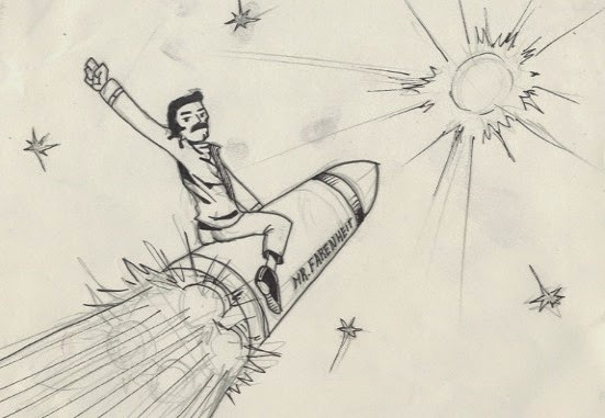


Finally I picked the Mr.Fahrenheit one. It is basically a pretty literal interpretation of the "Don't Stop Me Now" song lyrics, I'm referring here to the exact lyrics: "I'm burning through the sky, yeah
200 degrees, that's why they call me Mister Fahrenheit"
I thought it would be interesting to explore this further so these are a a few of the 8 drawings:
And then for the 12 panel narrative, I decided to basically interpret more of the lyrics from the song-
Overall, I had a lot of fun creating these. I could have done some of them more thoroughly but I am happy with the overal result.
Visual Lnaguage: Sketchbook
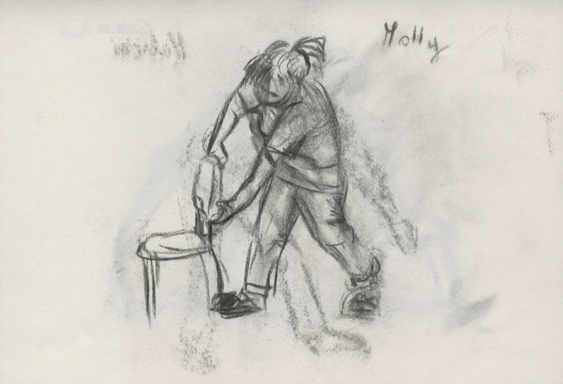
We have been recently briefed on the importance of having a sketchbook. We were told that it is important to capture these little moments in everyday surroundings and how they might come in useful while generating ideas. So that is what I tried to do. I tried drawing my course mates while they were working, these are my favourite ones-


To be honest my sketchbook has became my diary- it has all of my thoughts ideas and surroundings. And it's juts good practice to keep drawing even insignificant things.
To be honest my sketchbook has became my diary- it has all of my thoughts ideas and surroundings. And it's juts good practice to keep drawing even insignificant things.
Environmental Storytelling: Futurama
Futurama is an American adult animated science fiction sitcom created by Matt Groening and developed by Groening and David X. Cohen for the Fox Broadcasting Company. The series follows the adventures of a late-20th-century New York City pizza delivery boy, Philip J. Fry, who, after being unwittingly cryogenically frozen for one thousand years, finds employment at Planet Express, an interplanetary delivery company in the retro-futuristic 31st century. The series was envisioned by Groening in the late 1990s while working on The Simpsons, later bringing Cohen aboard to develop storylines and characters to pitch the show to Fox.
Futurama is set in New New York at the turn of the 31st century, in a time filled with technological wonders. The city of New New York has been built over the ruins of present-day New York City, which occupies New New York's sewers, referred to as "Old New York." Various devices and architecture are similar to the Populuxe style. Global warming, inflexible bureaucracy, and substance abuse are a few of the subjects given a 31st-century exaggeration in a world where the problems have become both more extreme and more common. Just as New York has become a more extreme version of itself in the future, other Earth locations are given the same treatment; Los Angeles, for example, is depicted as a smog-filled apocalyptic wasteland.
Numerous technological advances have been made between the present day and the 31st century. The ability to keep heads alive in jars was invented by Ron Popeil (who has a guest cameo in "A Big Piece of Garbage"), which has resulted in many historical figures and current celebrities being present, including Groening himself; this became the writers' device to feature and poke fun at contemporary celebrities in the show. Curiously, several of the preserved heads shown are those of people who were already dead well before the advent of this technology; one of the most prominent examples of this anomaly is Earth president Richard Nixon, who died in 1994 and appears in numerous episodes. The heads also appear to be in the age that the individual was most famous and not the older age in which they died. The Internet, while being fully immersive and encompassing all senses — even featuring its own digital world (similar to Tron or The Matrix) — is slow and largely consists of pornography, pop-up ads, and "filthy" (or Filthy Filthy) chat rooms. Some of it is edited to include educational material ostensibly for youth. Television is still a primary form of entertainment. Self-aware robots are a common sight, and are the main cause of global warming thanks to the exhaust from their alcohol-powered systems. The wheel is obsolete (no one but Fry even seems to recognize the design), having been forgotten and replaced by hover cars and a network of large, clear pneumatic transportation tubes.
Environmentally, common animals still remain, alongside mutated, cross-bred (sometimes with humans) and extraterrestrial animals. Ironically, spotted owls are often shown to have replaced rats as common household pests. Although rats still exist, sometimes rats act like pigeons, though pigeons still exist, as well. Pine trees, anchovies and poodles have been extinct for 800 years. Earth still suffers the effects of greenhouse gases, although in one episode Leela states that its effects have been counteracted by nuclear winter. In another episode, the effects of global warming have been somewhat mitigated by the dropping of a giant ice cube into the ocean, and later by pushing Earth farther away from the sun, which also extended the year by one week.
Futurama's setting is a backdrop, and the writers are not above committing continuity errors if they serve to further the gags. For example, while the pilot episode implies that the previous Planet Express crew was killed by a space wasp, the later episode "The Sting" is based on the crew having been killed by space bees instead. The "world of tomorrow" setting is used to highlight and lampoon issues of today and to parody the science fiction genre.
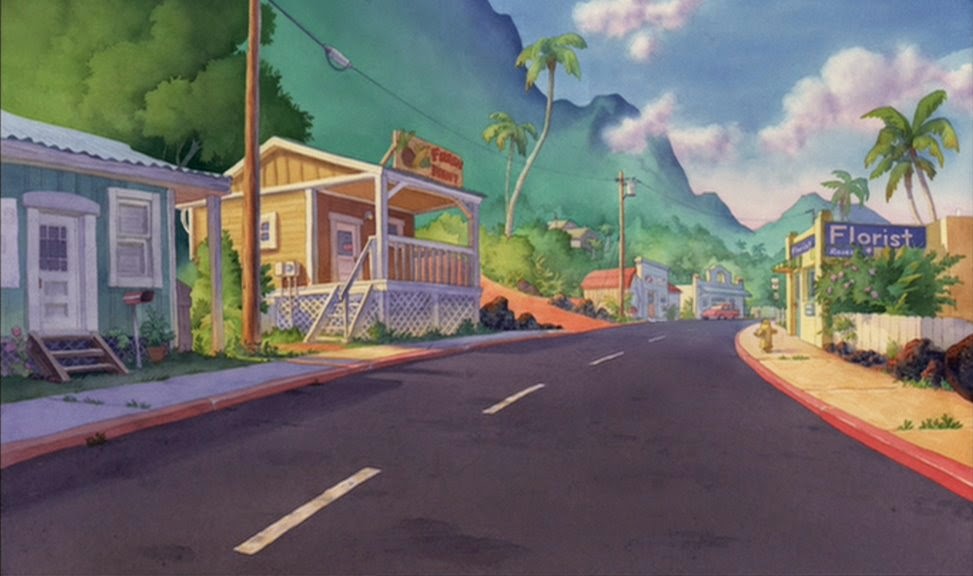
Enviromental Storytelling: Lilo and Stitch
I know I have already blogged about Lelo and Stitch, however I haven't touched on the backrounds of the movie.
In a deviation from several decades' worth of Disney features, Sanders and DeBlois chose to use water-colour painted backgrounds for Lilo & Stitch, as opposed to the traditional gouache technique. While water-colours had been used for the early Disney animated shorts, as well as the early Disney features Snow White and the Seven Dwarfs (1937) and Dumbo (1941), the technique had been largely abandoned by the mid-1940s in favor of less complicated media such as gouache. Sanders preferred that water-colours be used for Lilo to evoke both the bright look of a storybook and the art direction of Dumbo, requiring the background artists to be trained in working with the medium. The character designs were based around Sanders' personal drawing style, eschewing the traditional Disney house style. The film's extraterrestrial elements, such as the spaceships, were designed to resemble marine life, such as whales and crabs.


In a deviation from several decades' worth of Disney features, Sanders and DeBlois chose to use water-colour painted backgrounds for Lilo & Stitch, as opposed to the traditional gouache technique. While water-colours had been used for the early Disney animated shorts, as well as the early Disney features Snow White and the Seven Dwarfs (1937) and Dumbo (1941), the technique had been largely abandoned by the mid-1940s in favor of less complicated media such as gouache. Sanders preferred that water-colours be used for Lilo to evoke both the bright look of a storybook and the art direction of Dumbo, requiring the background artists to be trained in working with the medium. The character designs were based around Sanders' personal drawing style, eschewing the traditional Disney house style. The film's extraterrestrial elements, such as the spaceships, were designed to resemble marine life, such as whales and crabs.
Environmental Story: Adventure Time
The Land of Ooo is the main setting of Adventure Time, and is the home continent of Finn and Jake, along with all of their friends and foes. It is divided into many different kingdoms, of which the most prominent are the Ice Kingdom, Candy Kingdom, Castle Lemongrab, Wildberry Kingdom, Lumpy Space, Fire Kingdom, and Cloud Kingdom. There are also many geographical areas not known to be part of any kingdom, such as the Evil Forest and the Bad Lands.
Pendleton Ward, the creator of Adventure Time, has stated both in an interview[2] and in his FAQ page[3] that the Land of Ooo is actually a post-apocalyptic Earth, the result of a global disaster called the Mushroom War, hence the ruined pieces of modern technology scattered across the land.
It is possible that Finn may be the sole human being left in Ooo. It is also possible that the Mushroom War is responsible for killing off all the other humans, or that they mutated into the current and varied inhabitants of the planet. In "Her Parents," Lady Rainicorn's parents mention that they wanted to eat Finn because they never thought they would get the chance to eat an actual human, implying they are either extremely rare or extinct.
The Lead Designer of adventure time said that the creators set a high bar for the design of the animation, the characters, the environment, how ever made up or non-sense it might seem al the design details have to make sense, and they're very careful with the world they are trying to create, in order to tell the story effectively
Subscribe to:
Comments (Atom)